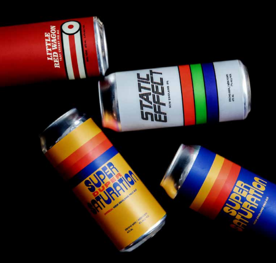
Label Design 101 — How To Ensure Your Colors Match
In the realm of design, the accurate representation of colors across different mediums is a critical challenge. Whether you’re a graphic designer, marketer, or business owner, understanding the difference between on-screen colors and printed colors is essential. This discrepancy arises due to fundamental differences in how colors are produced and perceived on screens compared to in print.
The Pantone Matching System (PMS) plays a pivotal role in bridging this gap, ensuring that colors are consistent and accurate regardless of the medium. Read on to learn how to choose colors that will look as great in print as they go on your screens.
The Difference Between On-Screen and Printed Colors
On-Screen Colors
The waterproof nature of BOPP is a significant advantage, particularly for products that are exposed to moisture or harsh environments. Unlike paper labels, which can deteriorate quickly when exposed to water, BOPP labels maintain their integrity. This resistance to water ensures that the labels remain legible and intact, preserving your brand's image and information. The durability of BOPP labels also extends to their resistance to oils, chemicals, and UV light, further enhancing their longevity.
Printed Colors
Printed colors, on the other hand, use the CMYK (Cyan, Magenta, Yellow, Black) color model. This subtractive color model works by overlaying ink in various combinations and densities to absorb (subtract) different wavelengths of light, thereby producing colors. In this model, the combination of all primary colors at full intensity theoretically results in black, though in practice it often results in a dark brown or muddy color, necessitating the use of a separate black ink.
The printing process introduces its own set of variables that can affect color accuracy. These include the type of paper, the quality of the ink, and the specific printing method used. Moreover, the reflective nature of printed colors (as opposed to the emissive nature of on-screen colors) means that ambient light and the viewing angle can influence how colors are perceived.
The Challenge of Color Matching
Given these differences, achieving color consistency between on-screen designs and printed outputs is a significant challenge. Designers often find that colors that appear vibrant and accurate on their screens look dull or muddy when printed. This discrepancy can lead to dissatisfaction and increased costs due to the need for reprints and adjustments.
The Role of the Pantone Matching System
The Pantone Matching System (PMS) offers a solution to this problem by providing a standardized color reproduction system. Pantone colors are created by mixing specific proportions of primary inks according to pre-determined formulas. Each Pantone color is given a unique identification number, ensuring that it can be consistently reproduced across different printing jobs and materials.
Pantone in Design and Printing
When a designer uses Pantone colors in their design software, they are working with a standardized set of colors that can be reliably reproduced in print. Pantone provides swatch books and digital libraries that allow designers to see the exact color as it will appear in print, reducing the guesswork involved in color matching.
During the printing process, Pantone colors are mixed according to the precise formulas provided by Pantone, ensuring that the printed colors match the designer’s specifications. This level of precision is particularly important for branding, where consistent use of specific colors is crucial for brand recognition and identity.
Pantone’s Role in Ensuring Color Accuracy
Pantone’s color matching extends beyond standard CMYK printing. It includes specialized colors that are difficult to achieve with CMYK alone, such as metallics and fluorescents. This capability ensures that designers have a broader palette to work with and can achieve the exact colors they envision, even for complex projects.
Pantone also offers tools for on-screen color calibration. By using Pantone’s software and hardware tools, designers can calibrate their monitors to ensure that the colors they see on-screen closely match the Pantone colors in print. This calibration process helps minimize discrepancies caused by different screen settings and types.
Industry Applications and Benefits
In graphic design, Pantone colors help maintain consistency and quality. For example, a company’s signature blue used on its website, marketing materials, and product packaging will look the same in all mediums, thanks to Pantone’s standardization.
The benefits of using Pantone colors are numerous:
- Consistency: Ensures that colors remain consistent across different print runs and materials.
- Accuracy: Provides precise color matching, reducing the risk of color discrepancies.
- Efficiency: Saves time and money by reducing the need for trial and error in color matching.
- Brand Integrity: Maintains the integrity of brand colors across various platforms and materials.
Other Factors That Impact Color Accuracy
The Pantone system does an amazing job of standardizing colors, however, there are a few other factors to consider.
The type of stock you choose for your print-on-demand labels will affect how your chosen colors look in print. White BOPP is essentially a blank slate, and you won’t need to make any adjustments to ensure color accuracy.
On the other hand, designing with metallic BOPP may mean that you’ll need to use a white plate layer in your design file — not to worry though, we have you covered with our article on how to use white plates.
Conclusion
Understanding the differences between on-screen and printed colors is crucial for anyone involved in design and printing. The Pantone Matching System provides a reliable and standardized solution to the challenges of color matching, ensuring that colors are consistent and accurate across different mediums. By bridging the gap between digital and print, Pantone helps maintain brand integrity and enhances the overall quality of printed materials.